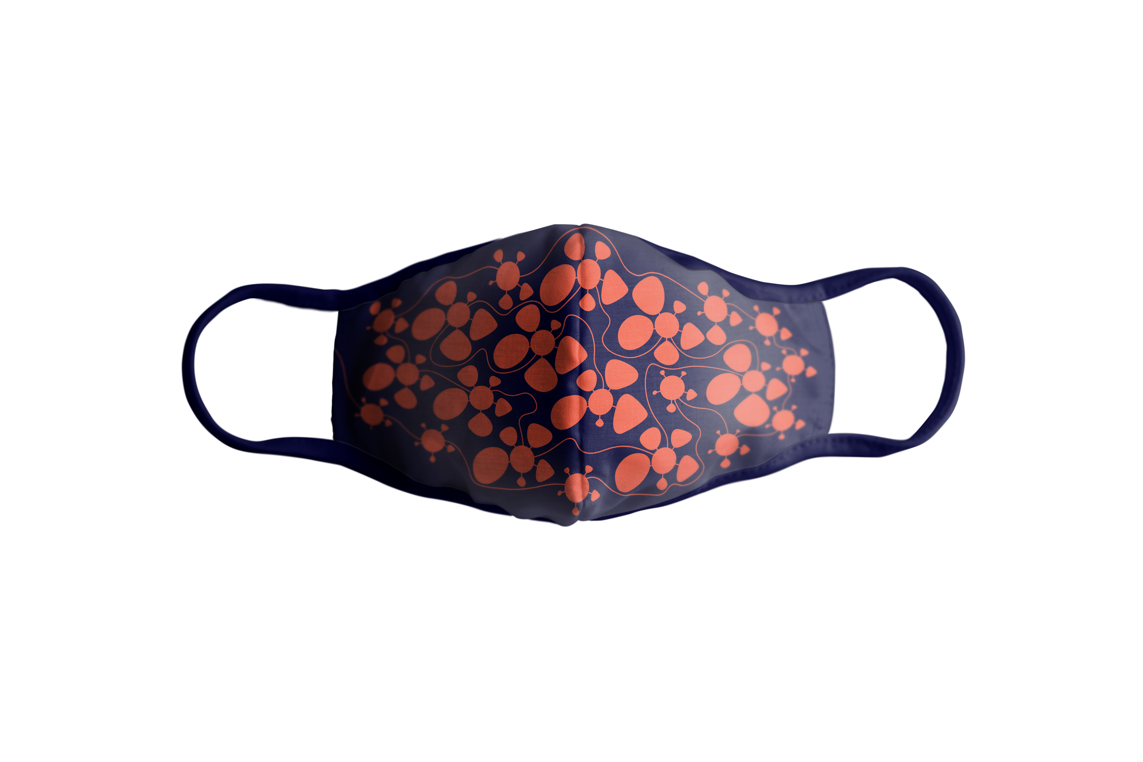
The goal of this collaborative project was to develop one or more stationary pieces or packaging for an organization or project of our choice based on the visualization of a data set related to a mission or issue. My partner Michael Dalton and I chose the issue of COVID-19, a topic that is quite relevant at this time. We used found datasets that included the testing results from the University of Illinois Urbana-Champaign and Champaign County ranging from August 8 to August 29. Each "glyph" shows the statistics from a single day during this frame of time.

Final poster design - Designed by Makenzie Heyen
This is our mockup product that we chose for our visual. Given the topic, it was only fitting that a mask was the packaging of choice. We placed the visualization on the mask in a way that you could see each day of the month by following the connecting line between each "glyph."

Along with the mask, we decided to create a business card in which presents the same information breakdown as the poster. This decision was made so that the consumer of the mask would also receive one of these double sided cards describing the purpose of the visualization and how to dissect it.

Visualization breakdown card - Designed by Makenzie Heyen
Process
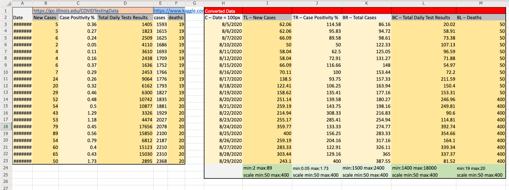
Data set used for visualization
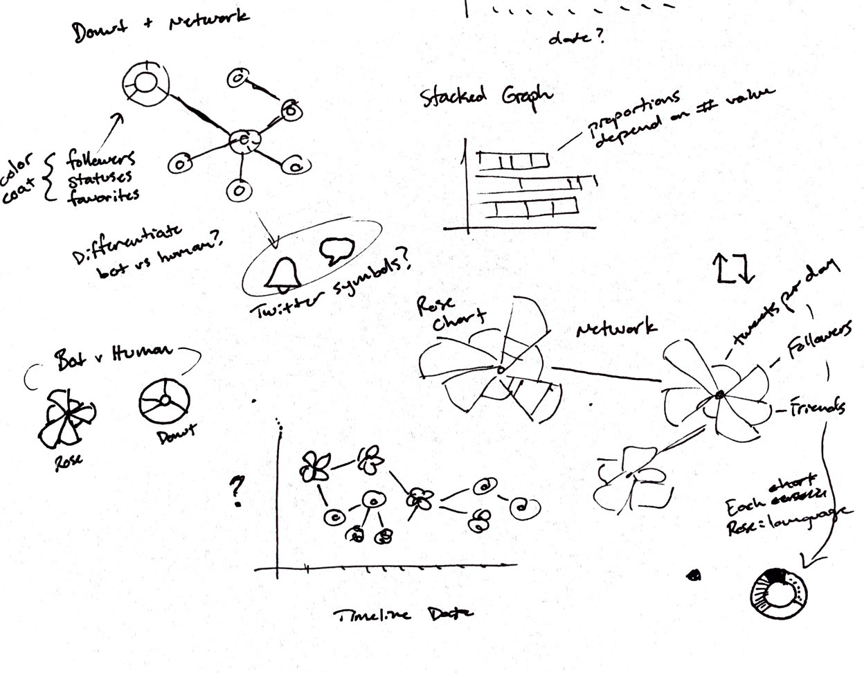
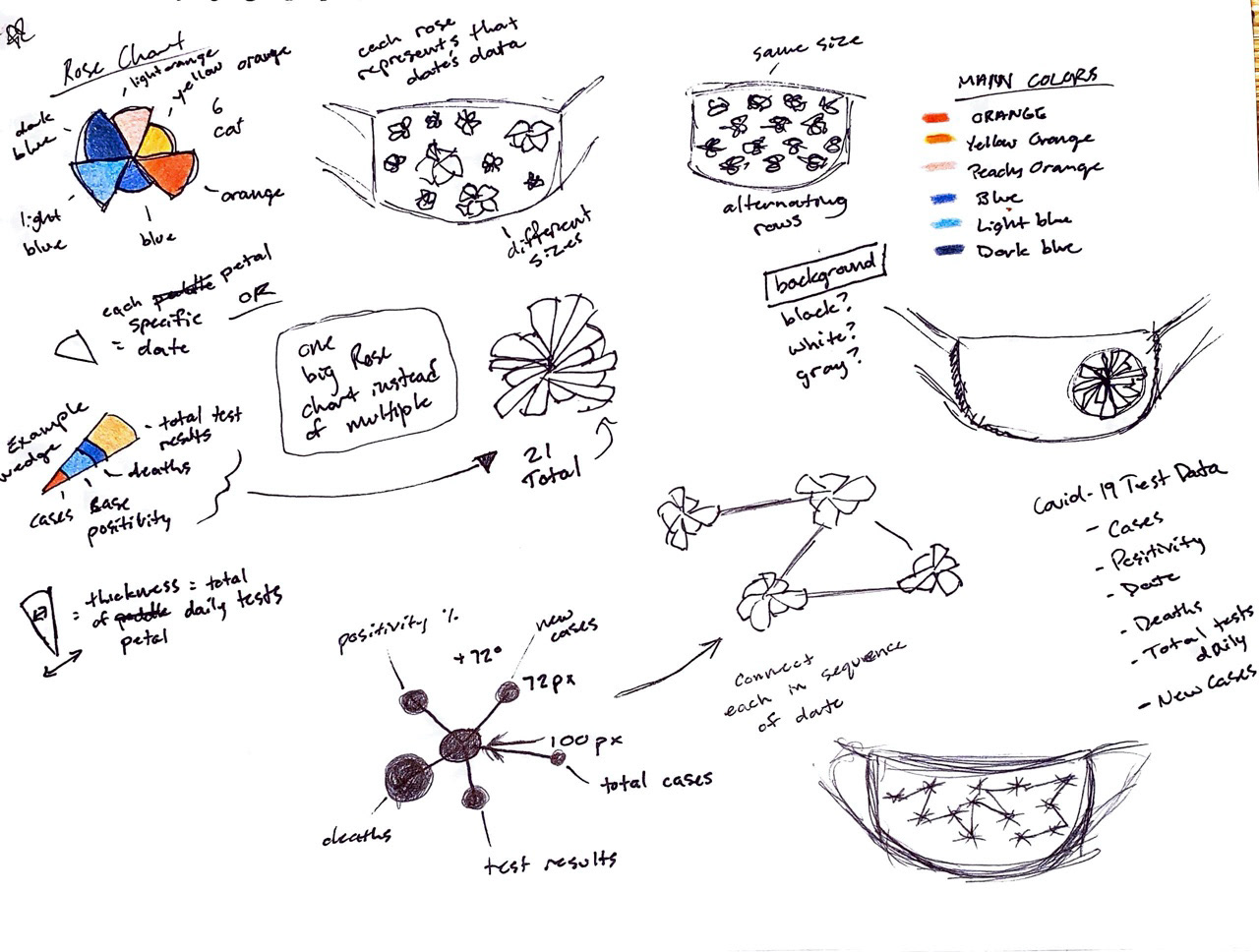
These are some of my preliminary sketches that started the brainstorming process leading to our final idea.

Final Visualization - Designed by Michael Dalton
On the left is the first draft of the poster along with our visualization. The first idea included all circles to show each column of the data. However, after receiving feedback about how the orientation of the "glyphs" may get confusing for the viewers to understand, we decided to use organic shapes instead. This way the "glyphs" stay oriented the same way and are easily differentiated from each other so that it diminishes the confusion of how each column is represented. The final poster design is shown on the right.

First Draft