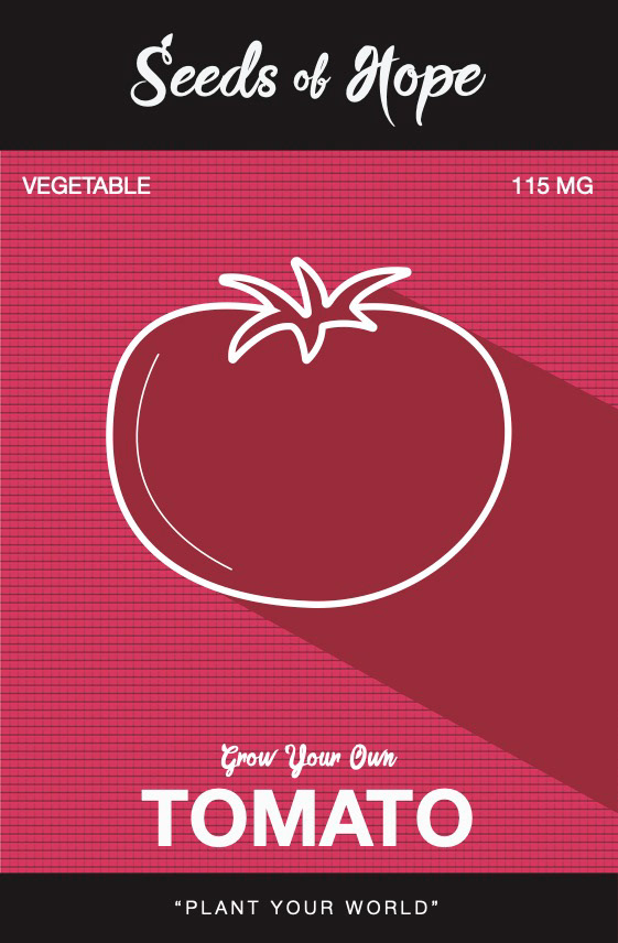
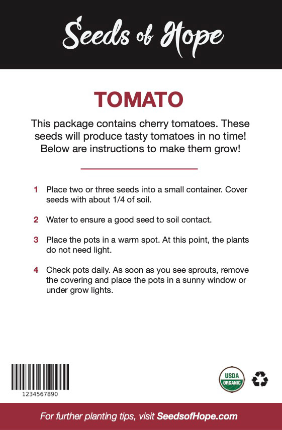
This project was based on creating a package design for a seed company. You could either rework an already existing company or create your own! I wanted it to be unique, so I decided to create my own called, Seeds of Hope. Seeds of Hope is meant to not only be a product to grow vegetables, but to give people who have no experience an easy way to do it themselves. The packaging gives you "hope" by giving easy step by step instructions on every package!
Final package design
Final mockups for how you would see them on their packaging. Shown below are several types of vegetables to display a preview of what would be available to you as a consumer.
These are some first iterations and typeface ideas for the wordmark. I wanted the wordmark to feel inviting, casual, and a sense of nature.
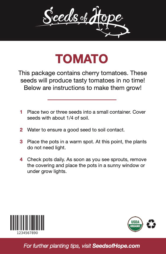
Here is the direction that I chose to go for the wordmark and its progression from first rendition to the final.
This sequence of designs were potentially how the package would look. The idea I had was to go with earthy tones such as a tan to really represent the feel of nature. However, I ended up taking a different route by sticking with the shadow but getting away from the tan earthy tone after realizing it may be too mainstream.
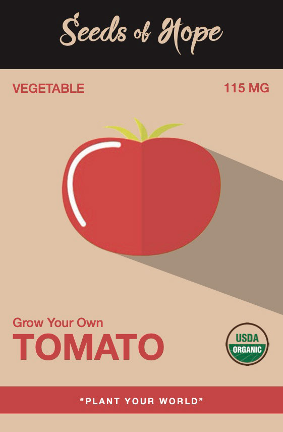
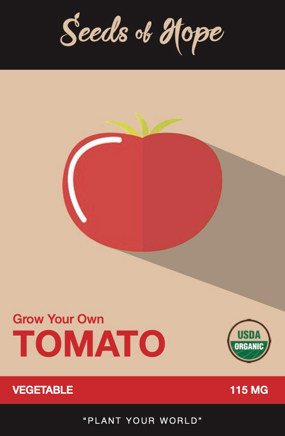


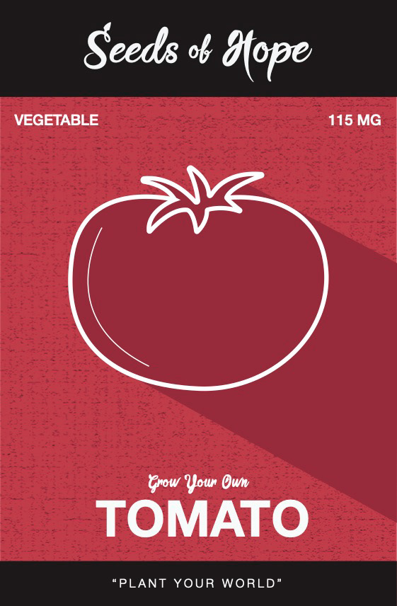
These design on the left is what I thought of being originally complete, however I noticed that the texture in the background was quite faint and hard to see. As a revision, I made a more organic texture to add in the background behind the vegetable which I feel represents my overall feel of the design.
